
Good fit, better days. Underwear with room where it matters — and a straight face only when it has to.
Namooney makes the layer nobody sees and everybody feels. We take the most ignored thing in the drawer, give it real engineering, and refuse to be too serious about it.
Fit first, physics second. Breathable pouch, no ride-up, no mid-meeting rearranging. Your boys get their own room, not a bunk bed.
A wink, never a nudge. We will happily make a joke about airflow; we will never make one about you.
Men 25–45 who upgraded the mattress, the coffee and the chair — and are finally getting to the drawer.
Five approved lockups. Pick by space, not by taste: if the wordmark reads under 90px wide, use the icon.



Keep clear space equal to the height of the bowl of the “o” on all four sides. Nothing — type, edges, product, other logos — enters it.
Wordmark · 24 mm / 120 pxIcon · 10 mm / 48 pxBelow these sizes the counters close up in print and the mark turns into a blob. Embroidery: never smaller than 15 mm.
The mark is already doing the work. Leave it alone.
Four neutrals, no accents. Black and cream carry the brand; charcoal and stone are supporting cast — backgrounds, labels, rules.
C0 M0 Y4 K93
Pantone Black 6 C
C0 M6 Y13 K65
Pantone Warm Gray 11 C
C0 M5 Y10 K19
Pantone Warm Gray 3 C
C0 M2 Y6 K6
Pantone 7527 C
Ratio guide: roughly 60% cream, 30% black, 10% stone across any surface. Charcoal is for body copy and secondary labels only — never as a large field behind the logo.
The logotype is the only groovy type in the system. Everything else stays quiet so it doesn't have to compete.
Better Days
abcdefghijklmnopqrstuvwxyz 0123456789
Size M · 95% Cotton
Short sentences, dry wit, one joke per surface. We can say “breathable” and “swamp” in the same paragraph — but the punchline is always the product, never the customer.
“Room with a view of nothing.”
“Ventilation: a family value.”
“Ends the 3 p.m. readjustment.”
“Softer by the third wash.”
Anything that shames a body.
Performance-tech jargon.
Exclamation marks. Ever.
Comfort is the joke and the product claim at once. Keep it anatomical, not sexual — a doctor could read it out loud.
“Anti-stick technology, also known as cotton.”
“Two things, one hammock.”
Airflow, temperature, sitting down, long flights, gym bags. Physics jokes age well.
“Your 3 p.m. self says thanks.”
Fine in email and packaging inserts. Not on shop-window vinyl, not in paid social headlines.
Anything with an eggplant.
Anything a 14-year-old would text.
If the laugh comes at the customer's expense, it isn't ours.
Tumble dry low
Do not iron — nothing in here needs a crease
Do not bleach
Air out after leg day
a luxury down
there. It's the
whole point.
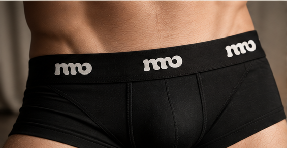
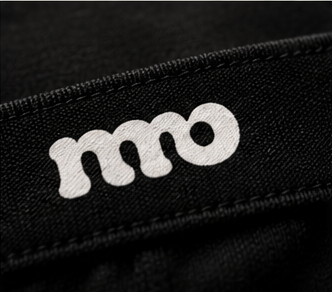
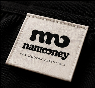
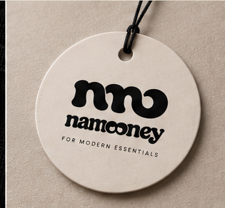
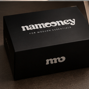
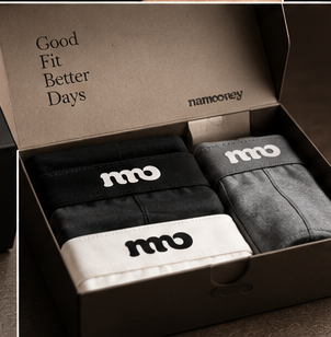
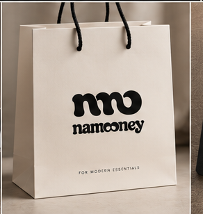
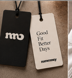
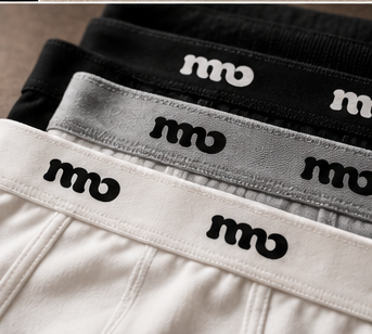
One mark, repeated. On product it is the icon; on packaging it is the full lockup with the descriptor.
brand@namooney.com